Making UI Materials in 3 Different Engines
The goal of this project is to learn how to create UI materials and shaders in 3 different Game engines: Godot, Unreal and Unity. More specifically, the aim is to create an ability cooldown UI system inspired by several hero shooters and similar genres.
TODO:
- Reference https://lawsofux.com/
- Maybe a peak like timer where the cooldown is split into bars for each second, the bars grow to the size of the cooldown??
Gathering inspiration
I started by gathering inspiration from games that heavily feature distinct abilities. I am also looking at the default layouts without any customisation or accessibilty settings.
Warframe
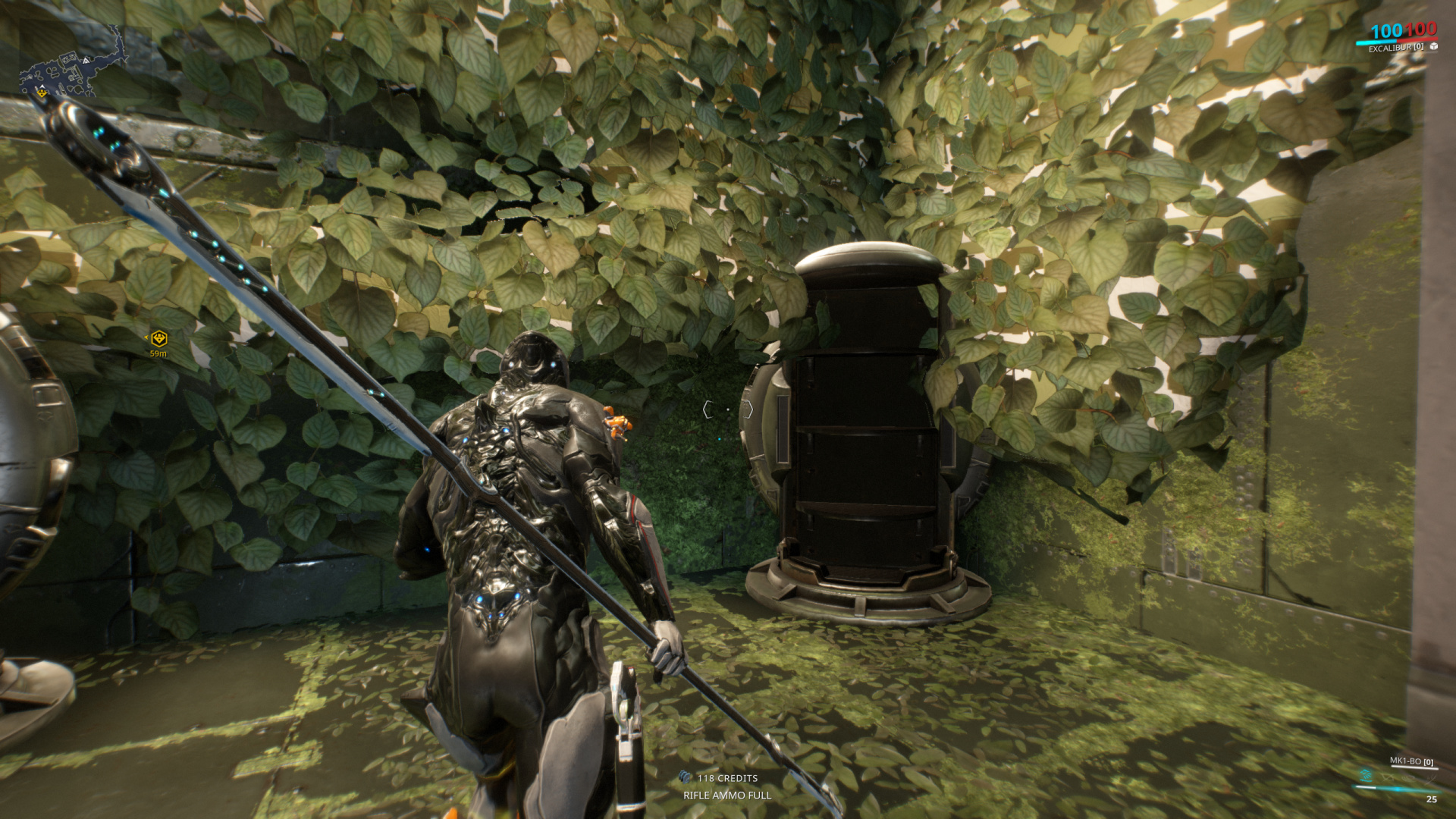
Warframe has a very unobtrusive display for the current characters abilities. A horizontal progress bar displays the users current energy, with the actual number displayed below. Above the bar is the 4 Warframe-specific abilities, represented with iconography. This system relies on colouring these icons based on the abilities status:
- Blue signifies an ability is currently active
- White signifies an ability is ready to be cast
- Grey signifies an ability is not ready
A potential issue with this colour coding system is colour blind users may struggle to discern which colour and state the ability is in
However, there are some strengths of this display. The energy bar has a pulsating animation, making the bar feel as if it is made from pure energy itself. This is arguably much more immersive than just having a flat progress bar.
Overwatch
Overwatch takes an opposite approach. Clean, flat and easy to read, Overwatch's UI is more adapted to it's competitive multiplayer hero shooter genre. One thing to note while comparing is that, whilst Warframe uses a shared energy system for most abilities, Overwatch has dedicated cooldowns for each one.
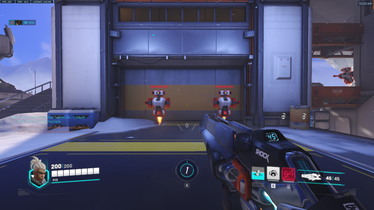
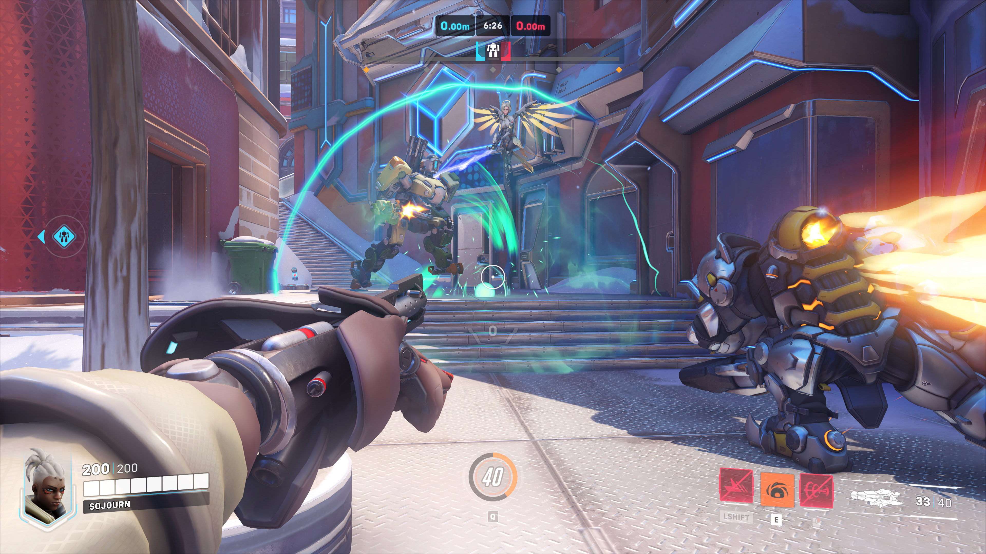
Whilst the colours are customisable, the general principle remains similar to the icons from Warframe but with enhanced visual changes for different states:
- When an ability is not ready, the entire panel becomes crossed out and the icon is faded away.
- When an ability is on cooldown, the button is greyed out and becomes a (bottom-to-top) vertical progress bar, with the seconds remaining overlayed.
- An active ability will have a solid colour overlay.
Its arguable whether the timer is necessary. Whilst a split second makes a big difference in a multiplayer FPS game, most skilled players will be focused on aiming and the 3D space around them rather than watching a timer tick down. On the other hand, seeing the exact amount of seconds left could be enough information to decide whether commiting to a certain play is a good idea or not.
Destiny 2
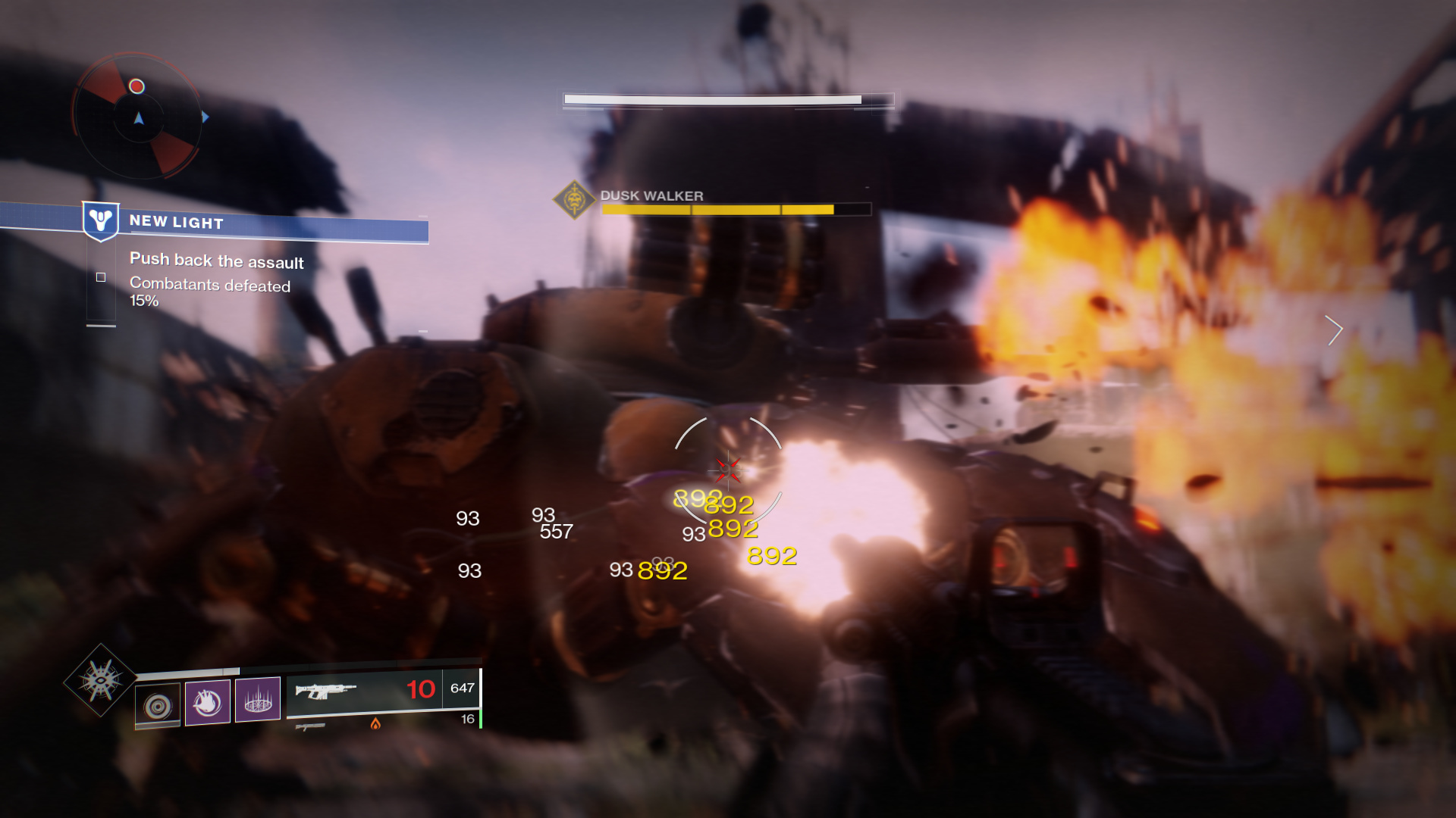
Destiny 2 was the final game looked at. It follows a similar approach to Overwatch by making the ability icon/panel a progress bar for time remaining when on cooldown. It also features a progress bar for the cooldown of the Super (A powerful, less frequently available ability) above the smaller cooldowns and weapon information.
Destiny 2 also opts for a flat UI design, comprised mostly of both opaque and transparent boxes with some icons to show what the user has equipped. It uses colour to display elements and types rather than the ability status itself. A potential issue is that abilities on cooldown could blend in with the rest of the game world, especially when looking at bright white areas, as they are essentially only a small transparent box with very thin white borders and equally transparent iconography.
Final Overview
Here is the main takeaways I got organised into a table
| Warframe | Overwatch | Destiny 2 | |
| Ability Cost | Resource-based | Cooldown timer | Cooldown Timer |
| Design Style | 'Fluid', glowing elements. | Flat | Flat |
| How Ability Status is conveyed | Colour Change Only | Colour + Progress bar + integer timer | Colour + Progress Bar |
| Potential Flaws | Overreliant on colour | The timer.. | Transparent white elements can be lost easily |
| Features I Like | Energy bar feels lively - mental connection | Also the timer.. | Clean design with a focus on widths rather than strange shapes |